Fundamentals of Digital:
1. Digital Imaging Fundamentals
The Beginning - Digital Imaging Fundamentals
The best place to start is the beginning! We discuss just what the Fine Print is, how we can move towards achieving really beautiful prints, and talk about the rules for making a fine print (and when they can be broken!).
We then really kick things off by moving on to the most critical step of Digital Fine Print production - creating an accurate and suitable print production environment, including notes on your work area, screen and video card, and of course, the essential process of monitor calibration.
Groundwork - Fundamentals of Colour, the Human Eye and Digital Images
Let’s begin - first we need to talk about colour itself. Because all great prints are, in the end, just artfully arranged colour on a medium.
Colour doesn’t exist without someone to experience it, so let’s start right at the beginning.
The Incredible Human Eye
… and Its Fickle Nature
The human eye is an awesomely sensitive measuring instrument, capable of seeing the universe in ways your camera can only dream of.
Printing is a con - just a great big trick.
It’s all about using a pathetically limited medium, a single, generally flat, piece of paper, to fool the human eye into thinking that it is seeing something vaguely related to rich and wonderful three dimensional reality.
Our challenge is to use the very limited tools we have available – contrast, colour - that sort of thing, to create a miniature world, capable of evoking emotion/stimulating thought/firing of the visual pleasure synapses.
What the world presents to the eye, and what the eye can take in, are so far beyond anything realisable on paper that it is amazing we can get away with this trick at all.
Lets look at contrast as an example. Imagine yourself on a beautiful tropical beach. Your eye, quite comfortably, will see detail in fluffy white clouds, and in the deepest shadows of the palm trees. I don’t know the exact figure, but it is usually quoted as being over 100,000:1 – that means you can comfortably look at a scene and see detail in the brightest object, where the brightest object is at least one hundred thousand times brighter than the dimmest object you can still see the detail of! Your camera can’t come close to capturing anything like that brightness range. Prints, even made with the very best printing systems, can’t achieve anything like that range of contrast – not even close - indeed printing rarely achieves over 200:1 contrast.
Looking at colour, we’ve got the same problem. The human eye can see a very broad range of colours indeed. Although, by animal standards, we’re pretty feeble. You might think a crow is a black bird but put it under a black (UV) light and you’ll see that it isn’t – it’s actually very colourful (to other birds with eyes sensitive to UV light, anyway). This is, perhaps surprisingly, quite relevant, because it makes us very conscious that when dealing with colour, we only care about what is commonly referred to as the visible part of the electromagnetic spectrum – that is, the only colour that really counts is the colour we humans can see.
From our high school science lessons, we’re aware (hopefully) that off one end of the spectrum is Ultra-Violet and off the other is Infra-Red, but we all know that the ROYGBIV rainbow is all that really counts to us (ROYGBIV = Red Orange Yellow Green Blue Indigo Violet). Already this should be giving you the feeling that colour is all about the observer – colour doesn’t exist unless its seen (if a tree falls in the forest and nobody hears it, are its leaves still green?).
To get back to the topic, the human eye can see a great deal of colour. And of course, just like with contrast, we can’t print anything like that amount of colour. We work within a pathetically small subset of colours the eye can see. You’ll see precisely how small soon.
What The Eye Wants
The eye, being such a sophisticated sensor, capable of such amazing things, craves these very things. Like any addict, it craves a bigger hit. It’s just like when you’re listening to music, and over the evening, you turn it up, then up some more, then eventually, around 5 o’clock in the morning, the neighbours are thumping on your walls and you’ve got yourselves a little problem with the landlord.
The rods and cones in your eye, those things that actually detect light and send the signal to your brain, get saturated with signal. So as you look at an image for an extended period, and Photoshop it from mere snapshot to work of Art, be aware that your eye is going to start lying to you. It’s going to tell you that your image needs a little more contrast. Maybe a little more saturation. And then a bit later, hmmm, maybe it needs a bit more punch! I know, I’ll boost the contrast some more. And add a little colour.
Pretty soon, your beautiful fine art portrait looks like a Hunter S Thompson novel.
The point here is that the eye needs breaks – when you’re working on images, what you see is not the same as what someone looking at your image for the first time sees. It’s not the same as what you will see if you go away, have a coffee, and come back to the image. So take regular breaks and give your eyes a chance to rest and replenish.
The Adaptability Issue
The human eye is an automatic adaptor - this is great for us, as it means when we move from different contexts (say indoors under warm interior lights to outdoors under cool blue sky) - we don’t experience massive and jarring colour shifts as the colour of light changes - indeed, we basically don’t perceive the colour of light changing at all unless its a very significant shift. However, devices like cameras do not automatically adapt in the same way. A camera, without being supplied a whitepoint (or if its auto whitepoint calculation fails) - will perceive a distinct orange cast to indoor light, and a distinct blue cast to outdoor light.
This automatic adaption is very handy for our day to day vision, but it fundamentally makes the human eye a very poor tool for objective colour measurement because our eyes instantly and subconsciously adapt to all sort of changes.
Colour - Light, Objects, Sensor
Colour seems obvious, really. The Rainbow - ROYGBIV - right?
Well, that’s only one part of the story. Colour is a remarkably fluid thing and pinning it down completely is next to impossible. Long, dull books (with a LOT of unpleasant maths in them) have been written on colour theory. We’re just going to cover the basics, so you can see why all this stuff is so hard, and so you can understand the tools you’re going to be using.
Colour always involves three things – a light source, an object to reflect that light, and a sensor to receive and interpret that light. Think the sun, the ocean, and your eye. Specifically, the visible wavelengths of light are bounced off the object and stimulate the rods and cones in our retina to send signals to your brain. Obviously, your perception of that colour will change if you vary any one of those three things – that is, if you use the moon instead of the sun, the sandy beach instead of the ocean, or you’re a little red/green colourblind.
So pinning down colour can be hard – no object IS a particular colour, it just appears to be that colour under certain conditions. There are no absolutes in colour – unless you control all three of those variables, you can never absolutely say what the colour of something will be and how it will be perceived by others. This is a Big Problem.
So now we’re going to talk about the basics of the three things involved in colour:
- Light
- Objects
- Sensors
Light
Light can be thought of as a wave, and we can see wavelengths that fall between 380 and 700 nm. This is the visible spectrum, and what we commonly refer to as, simply, light. From 380 to 700nm, we have named the colours, and it looks kind of like this:
(UV) 380 nm - Violet Indigo Blue Green Yellow Orange Red - 700 nm (IR)(While IR (Infra Red) and UV (Ultra Violet) are not generally visible to the eye, they both do have some impact on fine printing, so don’t forget about them completely. IR is most relevant at the image capture end as digital camera sensors are very sensitive to IR, hence the IR filter in most modern cameras. UV is most relevant in printing because they show up in fluorescent optical brighteners).
The light we see is typically made up of many wavelengths, that is, our eyes simultaneously see and mix multiple wavelengths bouncing off an object, and form a perception of a particular colour from this mixing process.
White is what we get when light is made up of equal amounts of all the wavelengths of the visible spectrum. But think about a white piece of paper for a moment. The eye is pretty amazing, almost no matter what the light source, whether it’s the sun or tungsten lights or glow worms, our eyes will pretty much always look at a piece of paper under any light source and go, in a very simple and basic human way - ‘that’s basically white’. This is called colour constancy.
Our eye is great at ignoring, or coping with, different light sources. It’s one of the things that makes colour really hard. Our eyes are very adaptable, but digital systems are not. That’s why, for example, we have to define a white point when developing raw images from a camera.
We can see there’s no true definition of white, no such thing as ‘absolute white’. So we use a term known as colour temperature to talk about the actual colour of white light that we mean. Based on the Kelvin System, and it’s somewhat counter intuitive - higher degrees of Kelvin actually imply a bluer whitepoint. To remember this I think of Bunsen burners back in high school chemistry - as you gave the fire more oxygen it burned more powerfully and hotter, and the flame changed colour from yellow to blue. Here are some common white points encountered in digital imaging:
- 9000K – very blue white
- 6500K – so called ‘daylight’ on a pretty much cloud free summer’s day
- 5000K – many fine art papers are down around here, a moderately warm white
- 3000K – traditional tungsten light bulbs emit a quite warm white
- 2000K - candle light - positively red/yellow at this point
Objects
Objects reflect light. Which particular mix of wavelengths they reflect determine the colour of the object. They can of course, only reflect those wavelengths that are falling on them in the first place. (That’s why fluorescent tubes can make things look funny, because they simply don’t output certain wavelengths of light, so objects can’t reflect them, so then those objects look oddly coloured under fluorescent lights).
That’s about all you really need to know about objects initially, except it is worth considering one other thing in more detail …
Fluorescence is a property of objects whereby they change one type of wavelength into another – and it is most noticeable in really, really white things. Like your teeth, if you brush them. You know what teeth look like in a night club with those UV ‘black’ lights? Brighter than white. Well, the same stuff they use in toothpaste is also used in detergents for clothes, and more importantly, in papers - to make them appear really white. They’re called Optical Brighteners and some people get pretty upset about them. Probably unnecessarily, but the jury is still out on that to a certain degree. We’ll talk about optical brighteners more later.
Fluorescence is often important in colour management and digital printing because it can make things unpredictable, and that’s a big problem in managing colour. So we try and avoid it in both lights and papers, if we can.
Sensors (e.g eyes), and RGB vs. CMYK
Sensors – your eye is one, your camera another, and scanners are yet another. In some ways, they’re all very similar, in other ways, very different indeed. As discussed, the eye is very flexible in its response, whereas cameras and scanners are very much fixed in theirs.
The eye, your camera, and scanners are all fundamentally Red Green Blue sensors. This is really important – it’s the basis of all colour reproduction. Our eyes, and these machines, detect and mix these three colours to see all the rest.
On paper, however, we subtract reflectivity from the paper using the opposites of these colours (Cyan, Magenta, Yellow), to produce all the visible colours.
So, in either colour system, we can use just three primary colours to make all the others, which is pretty amazing. How that works is pretty complicated, but it will do for now just to know that it does, generally, work.
RGB is the language of light.
Red, Green and Blue are known as the additive primaries – because we add them together to get all the colours.
CMY is the language of ink.
Cyan Magenta and Yellow are known as the subtractive primaries, because we use these colours to subtract reflectivity from white (i.e. paper) to get all the colour.
Some of you are bound to be thinking, right about now (if you’re still awake) it is CMY K not just CMY. So what is that K all about? The K stands for black, and it is added into the ink mix for two main reasons – one, to get better, purer blacks, and two, because it is cheap. And for most printers, cheap works. When we talk about CMYK later, we’ll go into more details.
It’s worth noting that there’s a pretty fundamental difference in the nature of light based systems and ink based systems.
In light systems, you get more saturation by adding more light together, so your saturated colours tend to be at the higher end of the brightness scale.
With ink systems, you make more saturation by adding more ink (and therefore subtracting from the paper’s reflectivity) - so you tend to get your more saturated colours at the lower end of the brightness scale.
The two sets of colours (RGB and CMY) are complimentary (or opposites) – here’s the digital colour star:
As you can see, The digital colour star shows you the way these things work – if you’re trying to get rid of blue, you need to add yellow (or reduce both cyan and magenta). There’s no such thing as a ‘yellowy blue’!
It’s really worth drawing yourself one of these (or copy this and print it out) - and keeping it handy for a while. It really helps when you’re trying to make really subtle changes to colour to have a good grip on how the colours all relate with each other.
Some Concepts & Basic Terminology
We’re just going to introduce a bit of colour related language now.
Standard Lights (D50/D65) and The Standard Observer
The upshot of all the above is you need to start thinking of colour as a fluid thing, dependent very much on three separate parts (Light, Object, Sensor). That is, the properties of the original light source, the object you’re looking at, and what you’re using to look at it (i.e. the sensor involved).
Given there are so many variables in colour, it’s hard to talk sensibly about colour without defining a few things. So we have to define absolutes, or reference points, so that we can get to grips with all this.
Standard Light Sources
The most important of these definitions are the reference light sources. There is no sensible way to talk about the colour of something under any possible light source. So first we define some basic, sensible light sources. You may have heard of these before – in particular you may have come across D50 and D65.
- D50 is a light source with a whitepoint of 5000 kelvin.
- D65 is a light source with a whitepoint of 6500 kelvin.
The whitepoint is the most important thing, but of course they both have a bit more to them than that - notably they each have defined spectral output curves which define exactly how much of each given wavelength of light they emit.
Once you have a precisely defined light source, you have nailed one of the three variables to the wall. In theory anyway. In practice, you will almost never come across true D50 lighting. Fortunately, there are a lot of 5000K balanced lights out there that come acceptably close. You can buy lights that come pretty close to the D50 standard and this is an excellent thing to do if you’re going to be evaluating colour and prints with any seriousness.
The Standard Observer
The next thing we nail to the wall is the range of colour the human eye can see – the only colour that is really relevant. This has been measured for us, and is called the 2˚ Standard Observer. This results in a particular colour space called CIELAB, which is a description of colour as the human eye sees it – roughly. More on this later.
Objects
We’ve now standardised two of the three variables – the light source and the observer. All that is left now are the objects, i.e. prints.
Well, the objects we create are ink on paper, and how skilfully we put it there is what determines how good a printer we are. Of course, unless we fancy grinding our own pigments (great video here!), we have to use the inks we can easily buy to produce our prints, so the trick is to really understand the behaviour of those inks and the printers using them, to create prints which look good - under standard light sources to standard observers!
In the real world, the reality is that we don’t normally have precisely the standard light source OR the standard observer available to us, so in reality we’ll be working within acceptable tolerances, but it all works pretty well in the end. But you have to hang your hat somewhere, and for colour, the standards above are the commonly used hat racks.
Gamut
Gamut is just a word that means the total range of colours of something. The gamut of the eye are all the colours an eye can see. The gamut of a printer is all the colours that printer can reproduce (which is determined by the inks the printer is using, the paper/coating the inks are being put on, and the driver technology that is actually determining how that ink is being put on the paper).
Metamerism
A true definition of metamerism is quite complex, but metamerism in practice is the phenomenon whereby something you print changes colour unpredictably under different light sources.
This is most relevant to black and white printing, and is still a very common problem. Basically, say you can achieve nice, neutral greys out of an inkjet printer, or so you think. Take your nice neutral great print outside and it suddenly changes colour, taking on a unpleasant cyan or magenta cast. This is metamerism in practice, and in many cases, it is an unsolvable problem without pretty fundamentally changing your inks.
Optical Brighteners
Optical Brightening Agents (often referred to as OBs, OBAs, or Fluorescent Whitening Agents - FWAs) are chemicals used in many contexts - for example, they are put into detergents to achieve brighter whites and stronger colours. Toothpaste is another common place they are found.
OBs convert light through fluorescence, right at the far blue edge of the visible spectrum (i.e. UV light) into visible light, thus making whites appear cooler and brighter, and colours more saturated. This is done for marketing reasons (i.e. look at our lovely bright whites) and also to allow the manufacturer some tolerance in the paper making process (e.g. if the paper base of a particular batch is a little more yellow than spec., OBs can be used to cheaply bring the paper to a consistent state).
The jury is still out for many people on whether OBs are of real practical significance when considering the longevity of a print. Some people believe OBs will simply fade away over time, leaving the paper no warmer than it would have been anyway, and no warmer than papers originally sold without them. Others believe the chemicals are likely to have an effect on the long term survival of a paper (either causing greater degradation over time, or leaving the paper more yellow than it would have been were the OBs never present), and thus should be avoided at all costs. Some people just don’t like warmer papers and so are willing to accept OBs no matter what the cost!
The reality is that many prints made by great printers of days past, people like Ansel Adams, were made on papers with OBs in them. Undoubtedly they have a different visual appearance today to prints made on papers that never had OBs in them, but it turns out that many of these prints are still the preferred prints today! The character they have taken on (through the OBs fading) is actually still appreciated! Thus, as usual, the answer is not simple.
However, in terms of colour management, OBs are a definite problem. Firstly, they tend to promote metamerism, making colour casts on black and white prints under different light sources much worse, and they also mean that what you print now will not be what is on the page in a few years (as OBs fade much more quickly than paper coatings without them)…thus all your good work in colour management is negated after just a few years if you use papers with OBs in them. It may be the fading is very minor, so this may not be a real practical problem, of course, but some very bright white papers have a LOT of OBs in them (e.g. a lot of the Epson papers) so these should definitely be avoided.
If in doubt, and particularly in the gallery market, it is probably best to avoid them, or at least papers that have lots of them in them.
File Types
Let’s talk about the basics of digital image files. Understanding these is at the core of getting started with producing high quality files that give us plenty of flexibility later in the process.
Continuous Tone vs. Spot Colour
Just some terminology to describe the two types of imagery:
Continuous tone images include a range of colour densities, as opposed to line art which includes only solid colours (e.g. black text in a book). Photos are the most obvious example.
Spot Colour / Line Art images are just those having only a few chosen ‘spot’ (or solid) colours in them.
File Formats & Compression
Digital image files can have many formats. The most fundamental decision with file formats is whether to use a lossy compressed or uncompressed/lossless file. The difference is the same as with MP3s and CDs - one file has been subjected to a mathematical technique that dramatically reduces file size whilst only typically marginally reducing the reproduction quality.
In digital imaging, we should always try to use uncompressed file formats for our work. Modern computers are cheap and capable of manipulating huge files with minimal delay. So always use file formats that maintain the full integrity of your file. Typically, this means using either your applications native format (.PSD, for example) - or a standardised uncompressed file format like TIFF. If in doubt, a TIFF is pretty much always a safe bet. The observant among you will now say ’but wait - when I save a TIFF it asks me how I want to compress the image. Indeed it does, but it’s using a lossless (non damaging) form of compression, so you can essentially ignore this.
The only time to use lossy compressed files (e.g. JPG) - is when we are sending them somewhere - out to the internet, via email etc. Even then, modern file sending services often make it easy to send the large, original files, so resist using lossy compressed files wherever you can.
Vector vs Bitmap
There are fundamentally two types of digital image files:
Bitmap Images - These describe the image in question using dots (=pixels) (like a digital camera produces) - usually these are generated by cameras or scanners, or made using software like Photoshop. They are often also called ‘rendered’ images.
Vector Images - These describe the image in terms of lines, shapes, and splines (which may be packaged up as fonts etc.). These usually made in Desktop Publishing apps like InDesign or Illustration packages like Illustrator.
Choosing vector or bitmap is a fundamental decision.
Vector files are best, really - if you can use them they have many advantages - much smaller file sizes, and you can scale them to any size without experience any quality loss.
But of course, we can’t always use vectors. Cameras and scanners always produce bitmaps, and if we’re working with that sort of imagery, at the least those elements will be represented as bitmaps. Basically, anything with a great deal of fine detail is best represented by a high resolution bitmap. (More on resolution in a second).
Formats like PDF and .INDD are actually container formats that can package up elements - some of which may be vector, some bitmap - in many cases mixing both types within the one package.
The idea is to use the most appropriate type wherever you can and avoid mixing where you can. That is - avoid dropping fonts over a low resolution photo for example - when you scale this later, your font (now rendered as pixels) - will go all blocky.
Ultimately all vector images are ‘rendered’ into bitmap images when finally printed - in the end, all images end up being dots.
Control over precisely how this rendering is done can be important and it’s why, for example, at Image Science we only accept fully rendered files - no vectors allowed! This way we can avoid all common rendering issues like missing fonts or variable transparency behaviours in different app versions - the rendering has already been done by the image maker, who is of course the best person to control that process.
But rendering in many typical workflows happens just right before print, in the RIP (Raster Image Processor, which is either a dedicated RIP program or a ‘software RIP’ as found in Photoshop, Illustrator etc). This common process mistake is a classic cause of many print issues.
Pixels and Resolution
Knowing how a digital image actually works is really useful, because it helps you avoid common mistakes.
Knowing the basic of pixels, bits, resolution, and colour models, help you solve real world problems like – how big can I print a file and get away with it? How should I sharpen a print? How do I move between CMYK and RGB most effectively?
So we’re just going to wiz through the basics of digital images, ending up in the strange land of colour spaces, where we’re going to spend some real time.
Pixels - Greyscale
A pixel is a single dot of a single colour.
A bitmap digital image is made up of a grid of pixels.
To start simply, in a grey scale file, the value of that pixel indicates how bright it is, from:
0 - Black to
255 - White People think of these things as a theoretical black and white, but it’s better to start thinking of printing right from the start. Thus you might want to start thinking of these values as indicating D-Max (maximum density), or maximum ink black, and D-Min or Paper White (the colour of your printed medium with absolutely no ink on it).
Dynamic Range and Clipping
So, this is the tonal range we actually have to work with – we obviously can’t print anything darker than maximum ink black (determined by the machine, media and inkset we use), and we can’t print anything lighter than paper white (determined by the type of media we choose).
But we are free to roam within those boundaries, completely as we see fit. Indeed we need to roam within these boundaries, and right up to the fence - or we will get dull, lifeless prints lacking the full tonal range. But we really need to be careful stepping out of these boundaries. Because over the fence bad things live.
While I’ve asked you to start thinking of the boundaries as ink black and paper white, it’s important to remember that this isn’t necessarily the case – it’s only the case if our output medium is a print. If your final output medium is a monitor, then 0 and 255 are simply the blackest black and brightest white the screen can reproduce. The distance from black to white in any system is referred to as the contrast range or dynamic range of the system – i.e. the range of brightness levels a system can reproduce.
If we don’t get close to these boundaries, we won’t be taking advantage of the previously mentioned pathetically small amount of contrast (dynamic range) available to us, and that is bad because our prints will be flat and muddy looking, but if we step outside of those boundaries (called clipping), we’re going to be in very big trouble because we’re going to run out of detail and start committing some of the cardinal sins of printing - burned out highlights or shadows without detail.
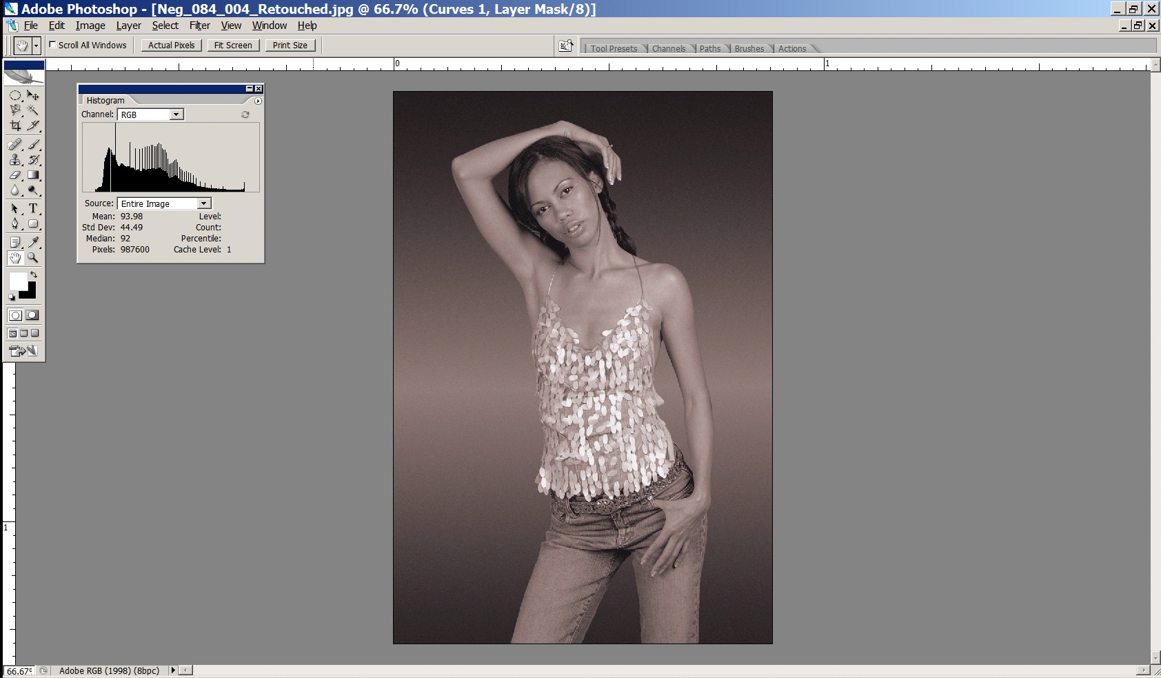
When we’re manipulating tonality in our images, be it with levels, curves, or any other tool, it’s very important that we make sure we are using the complete dynamic range we can (in general, occasionally you may deliberately want to keep your images within a narrow contrast range for effect), and the Threshold View in Photoshop is a really handy tool for this. You’ve probably seen this before, but just in case you haven’t, here’s the scientific way to determine the black and white point in your photograph, thus maximising your images use of the available dynamic range.
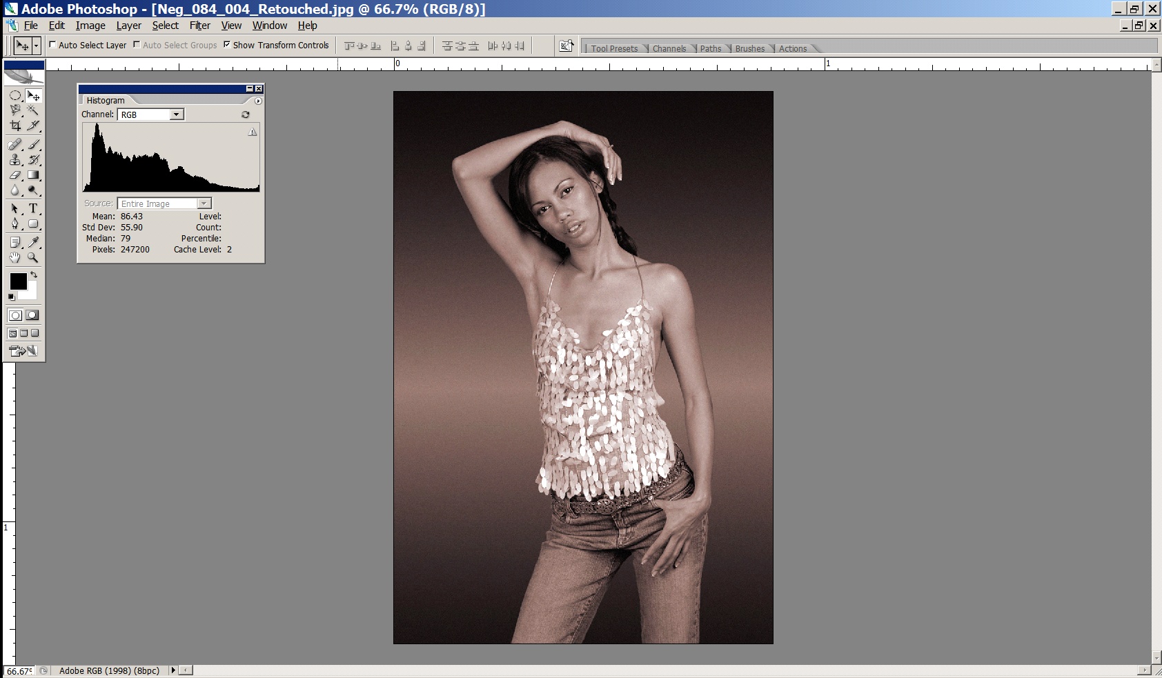
The image that follows is, at the moment, flat and lifeless, and the histogram for the image shows us why – the tonality is compressed and we’re not taking full advantage of the available dynamic range available to us. This can be seen because there are no pixels at either end of the tonal scale, that is, no pixels have values below about level 17 and above level 237. This is a typical example of a ‘raw’ scan you would get back from a high quality scanning lab (like Image Science!) – it is deliberately scanned in an unclipped form, so that maximum detail is obtained from the sensor.
A typical lab scan will try and make the image ‘more appealing’ on screen, because it will be done by a scanning operator with very little training – this is what you will get back from a typical lab:
You can see from the histogram that the image has been clipped – and the resultant image is way too high in contrast – printable detail in both the shadows and the highlights has been lost (e.g. the hair is now a black blob on the girl’s head).
So, starting with the first image which has all the detail from the original capture, rather than the second which is irreparably damaged, we now use the threshold view in levels to scientifically determine the black and white points.
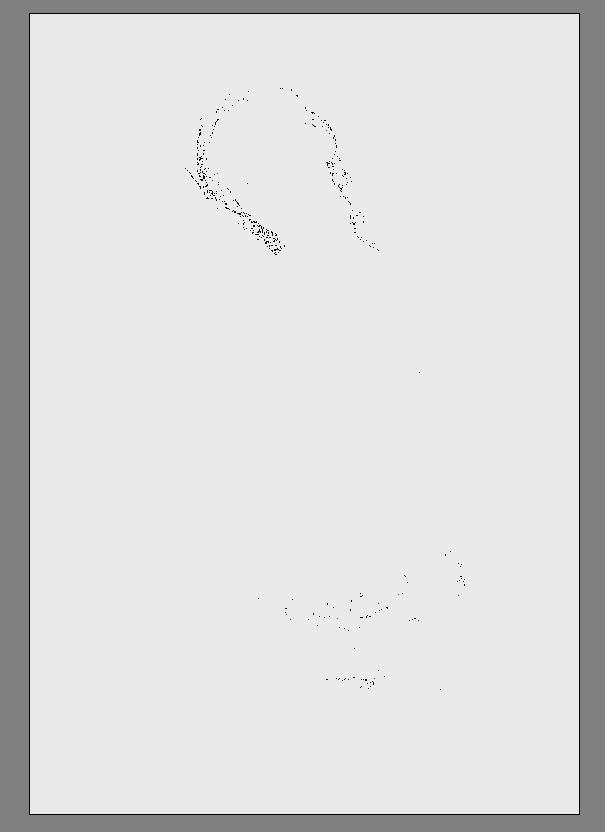
Open levels. Now, while holding down the ALT key (option on a Mac), drag the black slider to the right – the image will go completely white at first, and then as you drag the slider to the right you will see some pixels change colour. Those pixels that are changing colour are clipping in that channel (i.e. they will be set to (0,something, something). When the pixels go completely white, they are clipping in all three channels (ie are set permanently to
0,0,0 – maximum black).
Exactly where you want to set the black point is up to you – if you are trying to achieve maximum black in areas (e.g. an image with a totally black background) then this process can be used to set those pixels to absolute maximum black, so that when printed there will be no chance of weak, muddy blacks. However for most images, we generally only want the very darkest of pixels to print as max black, and to have detail in the image wherever possible, so we tend to set the black point to the value just on where the first pixels change colour:
Here I am allowing the very darkest areas of her to go pure black.
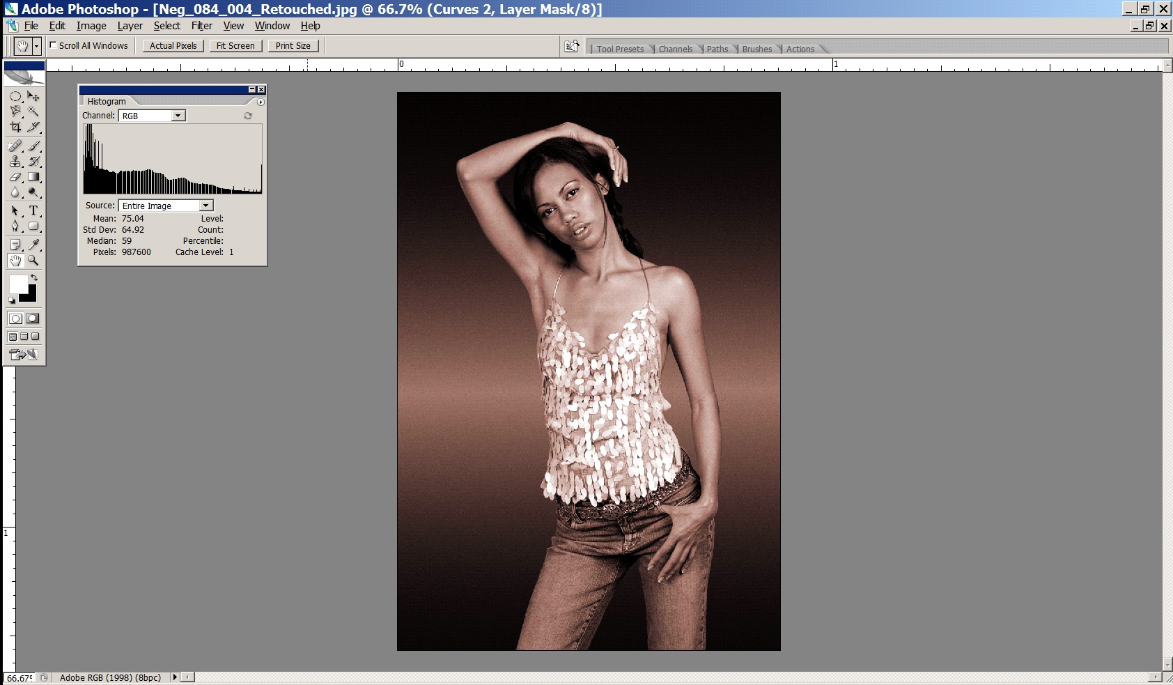
Next, we do the same for the white point – hold down ALT (option) while dragging the white point slider to see where the threshold view lies – remember, any pixels that turn white will be permanently set to 255 (ie paper white)

Here, I am deliberately allowing a few of the specular highlights off the girl’s top to be set to pure white. In images without specular highlights, I would set the white point to the level just before ANY pixels turn white. These highlights are deliberately specular (i.e. have no detail) and small – otherwise we would want their value to remain below 255 (i.e. paper white).
The result of this process is an image with appropriate contrast - making full use of the dynamic range available to us, but still with detail across the entire file (the histogram proves the details are there!). The histogram runs all the way from 0 to 255. The little lump at the far right of the histogram are the specular highlights we have set to 255.
Rule Number One
So, we’ve looked at how to stretch the tonality of an image across the full tonal range to take advantage of what little contrast range we’ve got available to us. The reason we use the threshold view is because it explicitly tells us which pixels we’re going to clip. Clipping is when we cause values in our file to rise above or fall below the threshold – that is, they are (permanently) set to 0 or 255. 0, as we know, is maximum black, and it isn’t necessarily a big problem, but it does mean we’ve lost any printable detail in those pixels. 255 is paper white, and this means, in reality, that we’ll be sending a signal to the printer to not lay down any ink at all for those pixels. This is bad, and it leads us directly to the first rule of printing…
Here’s the First Rule (and remember, every rule has an exception, and these rules are more like guidelines, but this first one is pretty much set in stone!):
Rule Number One
Never, ever, print paper white in your print.
It’s ugly, it stands out like a sore thumb and anyone who tells you different is blind or wrong. Printing paper white in your print area is the number one thing that will make your prints look dodgy and amateur. Printing paper white in your print joins your image with the world outside your print. It defeats the fundamental goal of a fine print – that of capturing and holding the eyes attention.
Exceptions to Rule Number One
Specular highlights (tiny reflections, like those on the edges of metal), are ok to print as paper white. Even then, only if they are very small (like 0.5mm or less) and there aren’t thousands of them. Also, when you’re doing cut outs of objects (e.g. in a brochure) - it’s ok to pop those on pure paper white, of course. Rule number one is about highlights within the boundaries of your image.
Addendum to Rule Number One – About Blacks
Printing full ink black, on the other hand, is often very necessary. Without it your blacks will look weak and grey. But printing too much of it is fatiguing (and dull) to the eye. Unless you’re doing a commercial type shot on a completely black background, be wary of large, detail-less areas in a print. Black paper doesn’t have much of a story to tell.
Resolution
We’ve talked about individual pixels, but a single pixel on its own is no good to us. We need millions of them all squished together to make a decent image.
A complete grey-scale digital image is thus made up of a grid of pixels:
The resolution of an image is how many pixels it has – X by Y pixels.
Some examples: a typical digital camera file has 3500 by 2200 pixels. A typical 35mm film scan has 5400 by 3600 pixels. In Photoshop, I can create an image with 12000 by 12000 pixels if I like. It will take a lot of memory, but it will also mean I have lots of resolution to work with later. In general, more resolution is always better - it gives us more options with print size later.
PPI vs DPI & Screens/Dot Patterns
PPI - Pixels Per Inch
DPI - Dots Per Inch
Unfortunately, in the world of imaging, PPI and DPI are used almost interchangeably. They are two quite different things and the confusion of the two leads to more confusion than almost any other single thing in digital imaging from the file production end of things.
The first things to understand is that in digital imaging, the only thing that really counts about a file is how many pixels are in a file. Terms like megapixels, DPI and file sizes in megabytes only confuse the issue. In the end, all digital images are simply X pixels by Y pixels big (by Z bits of colour data but we can ignore that for now).
This is the only absolute measure of the quantity of information in a file (nb it has nothing to do with the quality of information in a file!)
In almost all cases, unless you are talking about physically how your printer is laying ink down on the paper, you are actually dealing with PPI - pixels per inch.
Dots Per Inch is an old printing term and has almost no place in modern digital imaging at the creation end.
DPI is a measure of how many tiny, tiny droplets of ink a printer is laying down in its dither pattern to form one inch of a print. Most Epson inkjets, for example, operate in Photo mode at 1440 DPI (can be as low as 720 DPI and as high as 5760 DPI). You tell the printer which mode to print in in the driver - this is usually camouflaged by the use of modes ‘Photo’, ‘Best Photo’, ‘Photo RPM’ or ‘Fine’, ‘SuperFine’. In the bigger printers you can usually choose the DPI directly as, say, 2880 DPI. Incidentally, almost all printers operate best for general photographic usage at around 1440 DPI. The higher DPI modes like ‘Photo RPM’ are useful if you’re printing really high key (i.e. all light toned) shots, but next to useless for general printing. In fact, they are worse than useless, they are positively damaging - way too much ink is laid down on the paper, resulting in seriously impaired shadow detail. And of course the more ink you use, the more ink you pay for (an Epson R800 running in ‘Best Photo’ mode is less than half as expensive to run as one left in ‘Photo RPM’ mode for instance, and in 99.9% of photos, you’ll get worse quality from the ’Photo RPM" mode!).
Pixels Per Inch is the key term. It is a description of the logical number of pixels from your original image (X pixels by Y pixels, remember) that will be used to tell the printer to print one inch on paper. Assuming a sharp original photograph with good technique (see resolution discussion below), the higher the PPI, the better the quality print you can achieve - this is testable as true even well beyond most claims of 360 PPI being the most you need … 600 PPI images can easily be seen to be much sharper again if this data is available at good quality from the original file).
PPI is a logical term - changing the PPI of a particular file does not in any way affect the file itself - it is simply a decision about how many pixels of the available pixels you will use to print an inch on page. You can choose any number you like - from 1 to infinity. The de facto standard for high quality, photographic printed images is 300 PPI - that is, for each inch of the printed image, there must be 300 source pixels to use.
This is why the ‘resample’ check box, in the Image Size dialogue, is the single most important (and dangerous) control in Photoshop! When you resample an image, you are actually changing the number of pixels in your image (i.e. changing the value of X and Y) - adding some or throwing them away. You should only do this if you are making an explicit and informed decision to do so, because no single other thing will affect the quality of information available to you from your file as this!
An example will make all this clear:
Say we scan a 35mm tranny at 4000PPI - this will result in a file that has 5400 by 3600 pixels.
We now want to make a print of 12 by 8 inches. This means the PPI we have available from our file for a print of this size is:
5400/12 = 450 PPI (or 3600/8 = 450). We are choosing to use 450 pixels to represent one inch of our print.
The printer driver will now translate those 450 logical pixels into 1440 physical dots per inch (DPI) and produce a very high quality print for us.
If we wanted to know the maximum print size we can achieve at good quality, and we know from experience that given a sharp original outputted on an Epson inkjet, 240 PPI is sufficient, we can calculate the maximum print size by taking the total number of pixels available to us (5400 on the long edge) and dividing it by the PPI required to give us, in inches, the size of the print:
5400/240 = 22.5 inches
3600/240 = 15 inches
So, our final print will be 22.5 by 15 inches, with 240 pixels used to represent each inch. And of course, the printer will actually use its 1440 dots per inch to actually print that image to paper.
Hopefully that is clear - it can be a bit confusing at first. Just in case, you can read another version of the same stuff here to get a different perspective on it.
Pixels - Colour
In reality a colour image is really three grids exactly like the one above, overlaid, one for each channel – the red channel, the green channel and the blue channel.
Each pixel in a colour file is actually a composite of three colour components representing the saturation of light for that colour – a red value, a green value, and a blue value. Mixed together these three colour components give us the pixels final colour. Here are some examples:
(0,0,0)         – No red, No green, No blue
                = BLACK/Ink Black

(128,128,128)   – Midtone RGB  = 50% GREY
(255, 0, 0)     – Most saturated red
(0, 255, 0)     – Most saturated green
(0, 0, 255)     – Most saturated blue

(255,255,255)   – Most saturated R,G,B
                = WHITE/Paper White
The range we work between is still black (0,0,0) and white (255,255,255) but at the end of each tonal scale for each colour is not the brightest pixel of that colour, but the most saturated. So with respect to each colour we’re working between zero saturation and maximum saturation. If we clip a particular colour channel, just as we talked about clipping the grey channel above, we are clipping the channel to the maximum saturated colour. This is bad because it’s going to lead to lumps of undifferentiated colour, which will really stand out in a fine print.
Bits and Bit Depths
Why are the numbers we use always between 0 and 255 and not something nicer, like 0 and 100.
Actually, they’re not. Well, they always are IF we’re talking about 8 bit images, then the maximum numbers are indeed 0 and 255. However, if we’re talking about 16 bit images, the real numbers are 0 and 65536! But it’s pretty hard to draw a graph on screen that is 65000 odd columns wide, so Photoshop always pretends the numbers are between 0 and 255.
Why 0 and 255 though? Well, this has to do with binary numbers. Basically, if you use 8 bits, or a maximum of 8 ones/zeros, the biggest number you can represent is 255.
000000000 = 0
111111111 = 255
And if we use 16 bits:
0000000000000000 = 0
1111111111111111 = 65536
Colour, in digital form, is like points on a line. The starting point on that line is black, or the absence of that colour. The ending point on that line is the most saturated version of that colour (let’s use red).
Note – and this is really important – whether you are using 8 or 16 bit images, the end points of those lines do not change.
0 is still black and 255 (or 65536 or whatever) is still most saturated red. There are just more gradations between the end points.
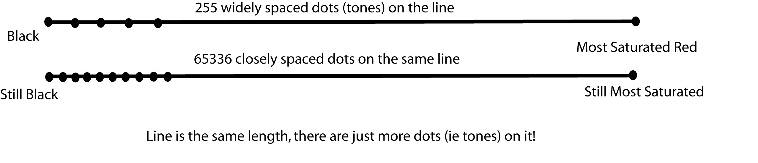
This means 16 bit does not mean more gamut is available to us (as everyone normally claims).
It does mean that there are more points on the line – that is, more tones in-between black and our most saturated red. So it means we have more smoothness of tonality between black and colour, not that we have extended our gamut. People get this wrong all the time.
With 8 bit, by mixing three colours (R,G,B), each between 0 and 255, together, we can get any one of 16.7 million possible colours. With 16 bit, by mixing our three values between 0 and 65536 together, there are more than 281 trillion tones possible. But the range of those tones (the gamut) is the same regardless of bit depth.
16 bit is always better – always use it if you can.
Here’s why 16 bit is better - because of the very nature of Photoshop (it’s really just a big maths engine), the operations you perform on colour numbers invariably result in a loss of tonality. Here’s a simple example with three pixels having three different brightness values:
Pixel one:     9
Pixel two:     8
Pixel three:   7
We want to halve the brightness of these three pixels:
9/2 = 4.5Hmmm, that’s no good, this is a computer and dumb, so we aren’t allowed to have floating point (i.e. decimal) numbers like 4.5 - we can only store a value of 4 or 5. Ok, so let’s make a decision to round all pixels down.
Pixel one:    9/2 = 4
Pixel two:    8/2 = 4
Pixel Three:  7/2 = 3.5.  Round down as per the above = 3.
So as a result of just one operation we get:
Pixel one:     4
Pixel two:     4
Pixel three:   3
Hmmm, suddenly instead of having a nice gentle tonal drop, we’ve compressed the tonalities of pixel one and two together such that they are now the same value. Stretch this example out over a file with millions of pixels, and maybe do several hundred operations over a long editing session, and you’ve got a big problem pretty quickly – all your tonality is bunching up around the same values.
The real, tangible result of this in your print is colour banding – that ugly, hyper-digital look where smooth tonality transitions are replaced by crude bands of tones.
With an 8 bit image, we have at most 255 levels for each colour. This means it doesn’t take too many operations before we run out of levels. With 16 bit images, there are 65000 odd levels, so considerably less chance the pixels will land on the same values, and therefore considerably less chance of banding.
The thing with levels is, we only really go down in the number we’re actually using. Sure, 255 (or 65536) are available in theory, but odds are when we capture/scan, we won’t use all of them – because they don’t exist in the original, or our sensor is incapable of actually differentiating all those levels. Then, with a few basic operations in PS like levels or curves, we end up using even less (due to maths stuff above, like rounding errors). Finally, when we get to printing, we translate the few colour levels we are using into the printer’s colour levels. So in the end, we’re probably not using that many at all! Luckily, it doesn’t actually take too many to create convincingly smooth tonality, but this is much easier to achieve if you start off with high bit depth scans/captures and then work in 16 bit in PS (and 32 bit editing is on the horizon).
Even if you don’t follow this, the take home point is to generate, capture and work in 16 bit whenever possible.
Colour Models
So far we’ve kind of skipped over some detail - we’ve discussed pixels, each having a number representing a colour - and we’ve glossed over alternatives and discussed the RGB model for colour. But there are other colour models. RGB is the easiest to understand conceptually, and the most logical to work in, so that’s where we started. But their are other Colour Models.
Models (RGB, CMYK, LAB etc)
Computers represent colours with numbers. In different Colour Models the numbers mean different things. Here are the three most important colour models:
RGB - three numbers, each representing an amount of Red, Green or Blue light, mixed to make the final tone
CMYK - four numbers per colour, each representing an amount of ink laid on a page, mixed to make the final tone
LAB - a mathematical system to define specific points (colours) within the gamut visible by the human eye.
We’ll look at each of these in more detail later.
RGB vs CMYK in a fight to the death!
Why did we start off not even acknowledging really CMYK?
After all, pretty much all printing is based on CMYK right? Well, yes, most printing is. Although that is changing with lots of alternative inksets and methods for printing, the fact remains the vast bulk of printing at its core is based on CMYK ink.
Traditionally, therefore, the print domain has been very CMYK focussed in its language and technique.
There is a HUGE issue with this, though. CMYK is the language of ink - and it’s a messy, dirty, ever changing language. The fundamental problem with CMYK is that it describes a concrete physical thing - CMYK numbers are in fact percentages of physical inks going onto a physical page. The problem with this is that we rarely know precisely what the RIGHT percentages of ink on the page should be. We don’t know the behaviour of the press, or the media. When originating our images, we might not even know IF We’ll end up using a press, or whether our media will be a low quality newsprint or a high quality coated stock.
So when creating our images, it’s totally inappropriate to be specifying them as ink levels on a page at this point. We simply don’t know enough to do this sensibly at this stage.
Also - CMYK behaves weirdly because it represents the weird, chemical world of inks - they simply don’t always behave as you’d logically expect. Almost never, for example, does mixing an even amount of C, M and Y result in a neutral grey ink. And if it did - change the paper and your neutral will no longer be neutral to the new whitepoint, so your specified ink values are wrong! Another classic issue is you would logically think you’d get your best black using 100% of C,M and Y. But in fact you usually don’t - for a variety of reasons. You might experience hooking - where the tones actually get lighter as you add more ink! Or you may encounter physical issues like pooling - where too much ink goes on to the page and you begin to get, basically, a puddle problem.
The tools you use are all inverted as well - logically and at a base human level, pulling something UP should make something brighter, stronger or more saturated. But in the CMYK world, up is down, black is white, and the tools simply don’t make as much sense as in the RGB world.
RGB is logical and well behaved. Use it.
It separates your initial colour representation from the physical - from the mess of actual ink on a page. It is designed to match the way your eye and brain work with colour. It’s easier, and creating with it properly gives a much higher quality result in the end if you know what you are doing - as it maintains your flexibility for longer, and means you will ultimately make just one conversion from a well behaved system (RGB) to your final ink-on-page ink colours. If you start off working in ink, you usually end up needing to convert from one weird ink system to another - and this always results in a loss of colour integrity. Work in RGB, create your RGB master files, and then from there move in the most controlled manner you can to print - and your RGB master files can often end up being very useful in multiple domains. If you tie yourself to physical ink too early in your process, you simply reduce your options later.
People who have been in the printing industry for a while are often VERY resistant to RGB in general. This is really based on their history (often taught at TAFE right on the press by the buckets of ink) - and not on rational thought or logic or any real in depth understanding of digital processes. Because big printers cost big money, there are a lot of wealthy old people without a lot of digital knowledge running those big printers. These printers are being rapidly undercut by smaller, smarter operators with a much more modern digital approach, thankfully.
The conversion from RGB to CMYK is really the printer’s actual job - it’s their job to understand their printer, to receive well and sensibly specified digital colours and translate those into the best actual colours on the page. If the printer CAN tell you a precisely accurate, specific CMYK language to deliver your files in, then you can control the conversion yourself (as the last step, from your RGB master file directly in to the best matching ink representations in CMYK) - and there can be advantages to this - but it does mean more work for you of course, and ultimately the person putting the ink on the page is in the best position to determine the best ink values - so wherever possible, work in RGB and work with printers who understand this is the way modern digital imaging works.