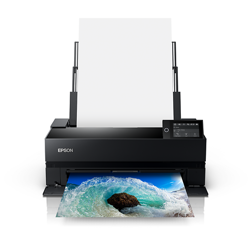
Summary: Achieving high quality black and white inkjet prints has classically been difficult, and this article discusses what the problems are, why they occur, and various methods of solving those problems.
Contents:
Introduction
Black and white printing is, in many ways, much harder than colour printing. This is counter-intuitive, perhaps, as the problem domain somehow seems more limited than with colour printing, but the reality is that it is much harder to make a convincing, beautiful print in black and white than colour.
This is perhaps because of how the eye takes in the two types of prints - with black and white prints, there is really no other information than contrast between tones within the print to form the image. With colour prints, the eye has much more information to work with and this leads to a more forgiving situation of blending, where the eye is much more tolerant of minor colour issues.
The human eye is particularly bad at seeing colours in groups - that is, when colours are grouped as in a colour prints, our eyes are very bad at making objective measurements of whether tones are correct (accurate) or not - and this happy situation means it is thankfully more easy to get a convincing colour print, as our eyes will happily accept a small amount of colour error in these situations and still judge the overall effect to be convincing. Of course master colour printers know that even though these prints are convincing, the really great prints are those that don't even have those colour errors, but that is a topic for another day.
With black and white prints, where the grey tones are all next to each other, the human eye's ability to make good objective determinations of colours when those colours are immediately adjacent comes into play. The human eye is in fact very good at this and will therefore see very small errors in tone/colour under these conditions. Which means we have to get black and white prints much more 'correct' for them to be convincing and pleasing to the human eye.
The Problem
First - let's define what we want to achieve: A print that is neutral under all conditions, with an excellent and smooth tonal range from black to white. The blacks must be dense and deep.
Inkjet printers work on the blending theory of tiny tiny dots - that is, millions of microscopic dots are placed on to the paper and because these dots are essentially too small to see, it is the blending of all these together that forms the tone our eyes see on these prints. Now, inkjet printers are inherently colour printers. They form their tones out of, primarily, tiny dots of Cyan Magenta Yellow and Black inks (CMYK). Of course some printers have more inks than this, but for most printers these are the primary tones with which to work. The paper starts as white, and as we put more dots (i.e. more ink) on the paper the paper changes tone from white toward black. This is known as 'subtractive colour' because we are using inks to 'subtract reflectivity' from a white surface.
In theory, an even mix of very small dots of Cyan, Magenta and Yellow creates an area on the page of roughly grey tone. In particular, this is how the highlight grey tones are mixed - by using very small quantities of these three inks on the page in roughly even proportions. Of course it is very difficult to get this mix precisely right- and the mix required will also vary significantly from paper to paper, as the tone of each paper will of course be different.
If we're trying to achieve a very dark grey tone, we must put down a large amount of all the inks - C, M and Y. This can be problematic as eventually we will be putting so much ink down that paper will no long be able to absorb that much ink - so this is when the black ink comes into play. We can substitute black for a significant amount of the CM and Y ink, and in fact create the same tone as we would have got by just mixing the CM and Y inks together. This is known as 'Grey Component Replacement'. However, it can be difficult getting the crossover point to be smooth - that is, it can be hard to decide exactly where, and in what quantities, to use GCR as very often the visual results of this process are not perfect and the eye will see the sudden change between tones mixed from just CMY and those mixed with CMY and K.
As the ink mix approaches black, we encounter a further problem - intuitively we imagine that to get a neutral, deep black from an inkjet printer, we print pure black ink. However it turns out that most inkjet printer black inks, and especially those in pigment ink printers, are not in fact all that black or dense - they are in fact a fairly warm tone as they are mixed primarily from carbon, which is a dark brown colour, not black. So Cyan ink is typically mixed in with black to produce a deep, neutral black. Again getting this mix right can be quite difficult, and it can be hard to achieve perfect smoothness.
Thus you can see that smoothness and neutrality across the entire tonal range from black to white can be very difficult to achieve with an inkjet printer, as there are lot of different ink mixes required along the tonal range to achieve the tones we need. In reality, with most consumer level printers below $1000, the actual results are very poor indeed - not even close to neutral, with significant colour casts, and with noticeable banding (i.e. lack of smoothness) issues as well.
Another problem regularly encountered in the inkjet world is the tricky problem of metamerism. A true definition of metamerism is quite complex, but metamerism in practice is the phenomenon whereby something you print changes colour unpredictably under different light sources. Basically, suppose you can achieve nice, neutral greys out of an inkjet printer, or so you think. Take your nice neutral great print outside and it suddenly changes colour, taking on a unpleasant cyan or magenta cast. This is metamerism in practice, and in many cases, it is an unsolvable problem without pretty fundamentally changing your inks. However there are some things you can do to reduce metamerism as an issue in your own printing (see below).
On Neutrality
Black and white prints are never really neutral, and defining neutrality is difficult (the definition is much like the famous one for the difference between art nudes and pornography - 'I can't define it but I know it when I see it'!).
Even those prints regarded as the benchmarks for beautiful black and white prints - fibre based black and white prints from the masters of the art such as Weston, Adams, Sexton and so forth - are not, in fact, at all neutral. They are in fact replete with subtle colours that come from the toning processes used after the initial printing to increase print quality, add tone, and increase the archival characteristics of the print. But this toning is very subtle and while it adds richness, depth, and dimensionality to the prints, it does not initially make the eye receive the print as a toned black and white, rather the first impression is of neutrality, and yet, on further inspection, the image as a whole is so convincing it almost seems as if we're seeing the scene in colour. Seeing one of the master prints in the flesh is a very worthwhile experience - there is an inner life to those prints that few people ever achieve with their own printing, but to which we should all aspire.
The simplest definition of neutrality is a print where the tonal grey scale from black to white runs along the tonal scale of the paper - that is - if a paper is warm toned, the a neutral print on that paper must have the same warm tone through the entire scale of tones from black to white. In fact this will be in in no way technically neutral when measured - the tones will be warm, not clinically grey (where grey is defined as tones reflecting all colours of light in even proportions), but the reality is that a technically neutral print on a warm paper will in fact appear to the human eye as a cool toned print. This is because when looking at the print, the eye will essentially 'white balance' to the colour of the brightest white on the page (more technically this is known as chromatic adaptation), making the technically neutral tones appear to the eye as cool tones.
Judgment Effects are a further problem with neutrality. That is these prints approach the limits of agreement between sets of human eyes. What is neutral to me is often not quite neutral to another person. While most people measurably see colour in much the same way, as we approach the neutral axis of vision, subjective judgment and physical differences in people's eyes start to reduce the agreement between judgments.
The holy grail of inkjet black and whites was for a long time 'the neutral print' (under all light sources). And this was, and indeed remains, very difficult to achieve. An important thing to remember is that a print does not have to be 100% technically neutral to appear acceptably neutral to the human eye. However strong colour casts will always be seen as non neutral by pretty much everyone, and in particular crossover casts are very uncomfortable for the human eye. Crossover casts are casts across a print that vary across the tonal range (for example, a magenta cast in shadows and cyan in highlights). Unfortunately with typical consumer level inkjet printers, crossover casts are very common. And crossover casts with funky metamerismic effects are not unheard of (i.e. prints have one crossover cast under, say, indoor light, and a different crossover cast under outdoor light!).
The Solutions
There are several solutions to the problem of black and white inkjet printing - as ever, more money will get you better results, but there are some quite effective solutions that are both results and cost effective.
1. Embracing toning
One way of dealing with the issue (and in my opinion the least effective and most problematic) is to 'embrace the tone'. This means that you acknowledge that with typical equipment, achieving neutral prints can be extremely difficult, so instead of trying to solve the issue, you simply run with it and add a significant amount of toning to all your black and white prints.
There's a number of very fundamental problems with this technique - not least of which is that none of your prints will ever really be black and white prints - they will all be toned prints. And toned in a way that is really quite strong - much stronger than traditional black and white toning ever was. Unfortunately this 'solution' has become quite common and has lead to the abundance of over toned prints so common today - with very strong and unsubtle tones. The tones have to be quite strong to override the natural colour casts in the inkset, and really these tones become quite unattractive and are really caricatures of traditional tones. I for one am thoroughly tired of seeing bright yellow 'sepia' prints or 'selenium' prints that are more raspberry than Prince's beret.
These heavily toned prints are also quite at risk of metamerism and judgmental effects - as you are predominantly using only one tone/ink, you run into the same issues as with neutral black and white prints
Overall, this is a poor solution to the problem and not really recommended.
2. 'Black Ink Only' Printing
With this solution, black and white inkjet prints are made by engaging the 'black only' mode in your printer driver. This is the easiest solution, and can be moderately effective. It is particularly effective with warm toned papers.
It works like this: an alternative strategy to using C M and Y to mix grey tones is to use only the black ink in your printer. However, the black ink is of course quite a pure black, and the only way to create the appearance of lighter tones is to spread the dots of black ink out to such an extent that they no longer blend convincingly into a single tone, and this leads to 'pepper' highlights (highlights that look like grains of pepper spilled onto the page). From a decent viewing distance, the results can be quite convincing, but these prints will noticeably lack smoothness when viewed up close.
However, the reward for this technique is that because only the black ink is used, neutrality is easy - there's theoretically no issue of colour casts, few issues with metamerism (the black inks in inkjet printers do not tend to have strong metamesmeric characteristics). Although a problem with these prints is, as mentioned before, that inkjet black ink is not really a neutral black, but rather a warm brown colour. This appears as quite neutral black on warmer toned papers, but can appear as overly cool on typical consumer resin coated papers. So while colour casts as a whole have been removed as a problem, these prints are always at the warmer end of the scale, and this may not suit all subjects.
3. Custom Printer Profiles
Custom ICC printer profiles are for many the best and most cost effective way of achieving reasonably neutral black and white prints.
Custom ICC printer profiles are a very effective way of producing the most neutral prints your printer can achieve, easily. They will not solve issues of metamerism, but can generally eliminate or distinctly reduce the colour casts on typical inkjet prints under typical lighting conditions.
Custom profiles work like this: you make a test print on your printer and the paper you will use for your printing (custom profiles are printer and paper specific). This test print contains some 1000 colour patches (many of them neutral or near to neutral tones) and tests the entire gamut of your printer. This test print is given to your ICC profile making service, and they read it in with a spectrophotometer. From these readings, a very precise tonal map (ICC profile) is made of your printer's behaviour on that specific media. That is, from that test print, we produce a piece of software that can tell Photoshop exactly what are the best signals to send to your printer to get the most neutral prints on that type of paper.
Happily, custom profiles are also the best way to get excellent colour prints from your inkjet printer as well, so all in all they are money well spent and can dramatically improve your printing.
More information about this service can be found here.
4. Alternate after-market ink sets
Another solution to the problem is alternate black and white ink sets - this can be an excellent solution to the problem is you happen to have an old spare inkjet printer available. Essentially, your colour inks are replaced with a set of dedicated black and white inks (that is, 4 to 7 shades of grey depending on your printer), and the entire printer is devoted to making black and white prints.
There are two main companies in this area, and both are very good. Piezography (we can source these inks in Australia for you), or MIS Inks (you need to order from the US), both have solutions available for a large variety of printers. There's lots of information on their websites, so we'll let you explore those on your own. It's certainly an easy path to excellent and archival black and white prints (the inks are pigment inks), but it does require a significant investment in hardware and use of the inks is not always trouble free (clogs can be an issue as you are often putting pigment inks through a printer with printer head designed for dye based inks).
5. Better printers with Advanced Black and White printing modes
The best and by far the easiest of all solutions to these issues is to upgrade your printer.
Inkjet printer manufacturer's have recognised the need for high quality black and white prints and have come up with printers that hold multiple black inks (ie. multiple shades of grey), in addition to their colour inks. When these printers are used to make black and white prints, about 95% of the ink going down on the page comes from the three or four black inks that these printers use, with only a very small amount of colour inks used in these prints. This makes achieving smooth, neutral prints with an excellent tonal range trivially easy.
The best of these printers is, at time of writing, the Epson 3800 which is an excellent printing machine for both black and white and colour and really is a near perfect 'darkroom in a box'. At roughly $2000 it is amazingly good value for money, and is in fact far cheaper than a good darkroom set up ever was. Results from this printer, out of the box, are stunning, easy to achieve, and highly archival to boot. A true example of technology really moving art forward, this printer is thoroughly recommended. Other models with the ABW mode include the Epson 2400 and some HP models also have multiple black inks.
6. RIPs and alternative software
An effective solution open to some is aftermarket software to drive your printer that is better at mixing grey tones than the standard driver that came with your inkjet printer. Unfortunately, this software only works with a small number of higher end printers - essentially the Epson R800 level of printer, and up from there.
The most cost effective, at about US $50, is Quadtone RIP. This tool can create excellent black and white prints from Epson pigment ink printers with the Ultrachrome and later inksets. It replaces the Epson printer driver and it creates prints with excellent neutrality and smoothness. It's only minor issue is that the resulting d-max (density of maximum black) of the prints is not that fantastic out of the box, and the user interface is a little clunky. That said, it is amazing value for money and if you have an R800, R1800 etc, it is definitely your best option. If you have a spectrophotometer then you can build your own curves and it becomes a very powerful printing tool indeed.
There is also a very expensive fully commercial alternative called ImagePrint that is very good, but really not very cost effective at this point (it's over $1000) - you'd be better off buying a better printer now (see above)
7. Media choices
Your media choice can have a significant effect on your ability to easily achieve high quality neutral prints free from metamerism. In general, warmer papers are more in sympathy with the tones of inkjet inks, so it is more easy to make prints with these inks. Generally warm tone papers do not have optical brighteners in them (see here). Optical brighteners can significantly increase problems with metamerism, and are best avoided where possible.
Matte, cotton rag papers (e.g. Crane Portfolio Rag), and some of the newer fibre based papers (such as Harman FB AL), tend to be very easy on the eye with black and white prints, with less optical flare issues than most consumer type papers with pearl finishes. If you are looking for a resin coated paper, the new Canson Infinity PhotoSatin is also an excellent choice as it has very low sheen and a surface very like some classic black and white papers, and is also quite cost effective.
Monitor Calibration and Black and White Digital Printmaking
Monitor calibration is a critically important part of any digital printmaking endeavour. It is, however, perhaps even more important with black and white than with colour - for the reasons discussed above. To get the tonal relationships you desire on to the printed page you must work on a carefully calibrated monitor that accurately depicts those tonal relationships.
At the top end are direct hardware calibration systems as featured in the best imaging monitors available today (the Eizo ColorEdge monitors). These systems make it easy to achieve a near perfect match from screen to print through virtue of having true contrast controls - you can even measure the colour of paper white from the paper you are printing on, and the density of black, and calibrate these screens to the precise contrast ratio and colour of the paper you are using! And better yet it is trivially easy to do with the great ColorNavigator software that comes with the monitor.
With a monitor without direct hardware calibration, you need to put a little more effort into things. Calibrate your monitor to basic default settings first - such as Gamma 2.2, Whitepoint 6500, Luminosity 100 candellas (and it's important you choose a monitor calibrator that allows you to control these settings, such as the Spyder 3 Elite or the Eye One Display). Once you have done this, print a basic step wedge on your (profiled!) printer. That is, create a file with wedges of 100 black, 95 grey, 90 , 80... etc through to white in it. Print this, view it under a suitable print viewing light (like a solux bulb) and compare it to your screen (remember that you should not hold your print next to your screen, that will not work as your eye will not be able to cope with the simultaneous viewing of both reflective and emissive images at the same time). When comparing your screen and print, the most important thing is that the overall sensation of density of the two matches. If your print seems darker than your monitor, re-calibrate your display to a lower luminosity (and if brighter, to a higher one). Once you have the overall density matching, you may need to slightly tweak the gamma to get the overall tonal response to math - that is, experiment with gamma 2.1 and 2.3 if you are finding the rate of change from black to white differs between screen and print.
Once you have things set up properly (and it can take several re-calibrations to achieve), you should then be able to make black and white prints that match your monitor very precisely indeed - that is, where on screen you see detail emerge from black, you should see the same matching tonal progression on your actual prints. And the same thing with highlights - you should start to see separation from white in the same place on your monitor as your prints.
A well calibrated monitor should also be neutral across the entire tonal scale, although cheaper monitors can really struggle with this even when calibrated. You can check this by creating a black to white gradient in Photoshop and looking at it carefully - can you see any colour casts, or worse yet crossover casts? If so, and these casts are severe, consider an upgrade to your calibrator and/or monitor. Good neutrals are fundamental to your overall accuracy.
A note on non neutral black and white images (i.e toned image such as sepia etc) - Even on an extremely well calibrated and expensive monitors, it can be hard to get toned black and white images correct. Because the image really only has one tone, and because it is filled with backlight on a monitor, it is common for there still to be some perceptive difference between the on screen display of toned black and white images and prints of these images. In this case, I find the best solution it to perform a classic 'ring-around' when you prepare a file with multiple versions of your print with slight changes to the toning, which you then proof print and from there choose the best toning for that image. It's an old fashioned technique but it really works!
A quick note on the very useful tool that is the Spectrophotometer
A general purpose tool that is well and truly worth having if printing is important to you is a spectrophotometer. While expensive (they start at about $1500), they are very very useful for measuring tones on prints. They can take very precise, totally objective measures of patches of printed colour which is extremely useful when trying to improve your printing results.
They have a myriad of uses in this area such as:
- measuring step wedges printed with various techniques to compare results in terms of neutrality and tonal range
- building black and white ICC profiles for the ABW modes with the new printers, which opens up the ability to soft proof with these modes and to improve neutrality over the default results. (Basically, you can print and measure small step wedges while tweaking the tone controls, which allows you to tweak the neutrality of the print with respect to the paper base colour to a very precise degree. Once you have the perfect formula for a particular paper, you can then ICC profile these exact settings and open up the option of soft proofing in Photoshop!).
- building custom curves in RIPS such as Quadtone RIP
- simulating classic types of alternative print techniques, although this is quite an advanced technique!